Turnstile Audio: Built to be Heard
Adorama needed a white-label audio brand built from scratch, in three weeks. Turnstile is what came out: clean, classic, understated. It's now printed on hundreds of products, and gear-conscious creators swear by it. What I built took it from a group of products to a brand.
They didn't want flashy. They wanted timeless.
Crafting a brand that hits all the right notes.
When Turnstile Audio came to Art of Visuals, they wanted a brand identity that struck the perfect balance: clean, simple, and inspired by the legendary audio brands of the past, but fresh enough to stand out in today's market. They didn't want flashy. They wanted timeless. Something that communicated quality and craftsmanship without overcomplicating things, and felt welcoming to both up-and-coming creators and seasoned pros alike.
A name that earns the volume it asks for. The timeline? Two weeks to design, iterate, and launch.


A single mark, three weights: confident, geometric, built to last just like the gear.
When Turnstile Audio came to Art of Visuals, they wanted a brand identity that struck the perfect balance: clean, simple, and inspired by legendary audio brands of the past, but fresh enough to stand out in today's market. They didn't want flashy; they wanted timeless, something that communicated their core values of quality and craftsmanship without overcomplicating things. The brand had to feel welcoming to both up-and-coming creators and seasoned pros alike.
Objectives. Craft a brand identity that captures Turnstile's ethos of precision, quality, and affordability. Design something that feels understated but undeniably cool, with a nod to the classic audio gear brands like Neumann and Shure. Make sure the brand speaks to both the budget-conscious and the experienced pro, uniting them under a shared love for great sound at a fair price.
I took a deep dive into the world of vintage audio brands, looking at what made them iconic and enduring. With that inspiration in mind, I set out to build a brand identity for Turnstile that was confident, modern, and a little nostalgic, all without trying too hard.
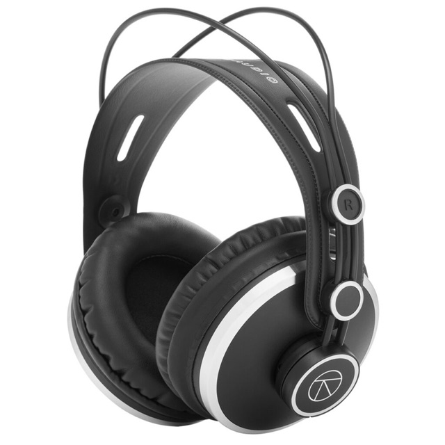
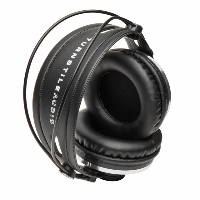
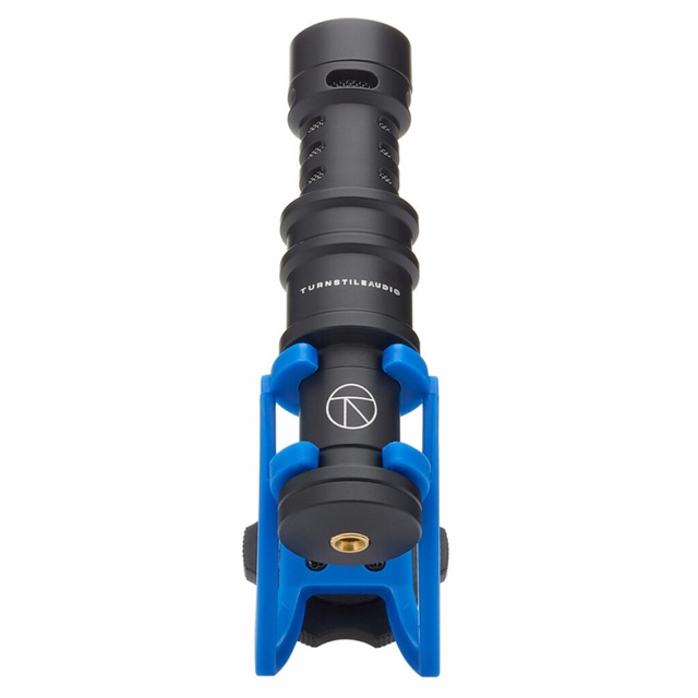
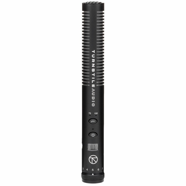
Logo Design. The logo needed to be simple, but pack a punch. I went for sleek, geometric shapes and clean typography, something that said, "We mean business," without being loud about it. The end result? A logo that feels professional and dependable, built to last just like Turnstile's gear.
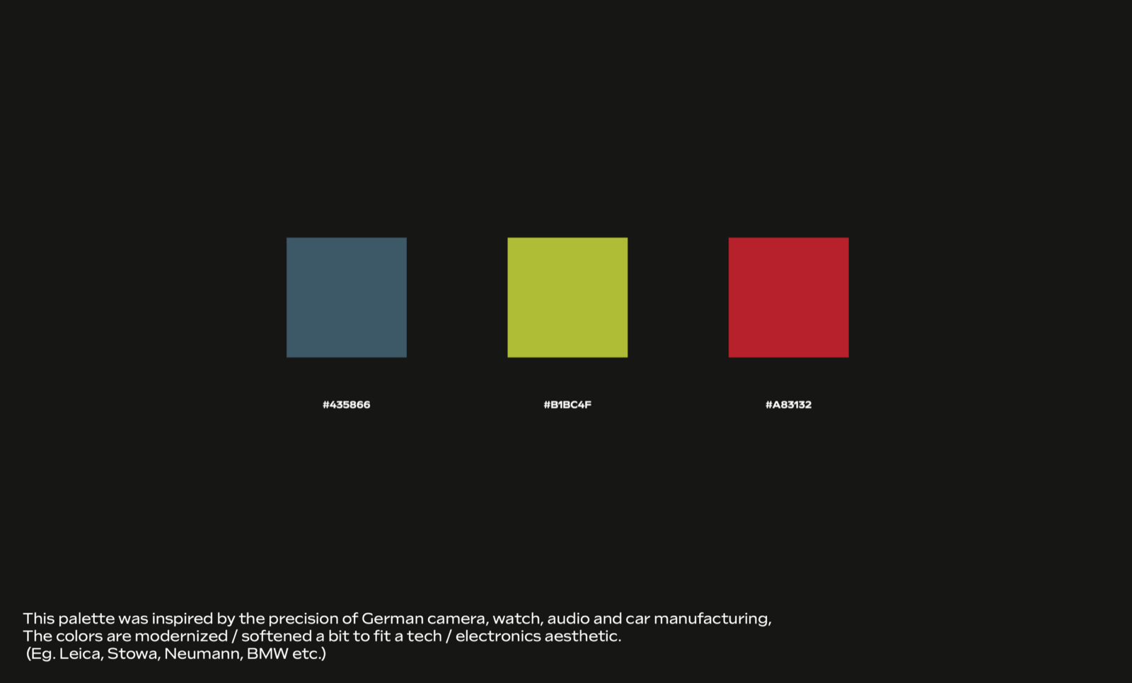
Typography & Color Palette. I kept the fonts sharp and straightforward, opting for a sans-serif typeface that says "trustworthy" without feeling stiff. As for colors, I went for neutral tones with a few metallic accents to give it that sleek, high-end vibe. It's all about letting the gear be the star of the show, with the brand quietly amplifying the message.
The new Turnstile Audio brand identity hit all the right notes. The fresh, understated design resonated with both emerging creators and seasoned pros, positioning Turnstile as the go-to choice for high-quality, affordable audio gear. The brand launch was a hit, driving engagement and sparking buzz on social media, all while boosting initial sales. Proof that a simple, thoughtful brand can make a big impact.
Conclusion. Turnstile Audio's brand identity now reflects their passion for delivering premium recording gear at a fair price. By blending a nod to audio legends with a modern twist, I helped create a brand that strikes the perfect chord with creators everywhere. Whether you're new to recording or a pro in the studio, Turnstile Audio makes sure you sound your best, without emptying your wallet.
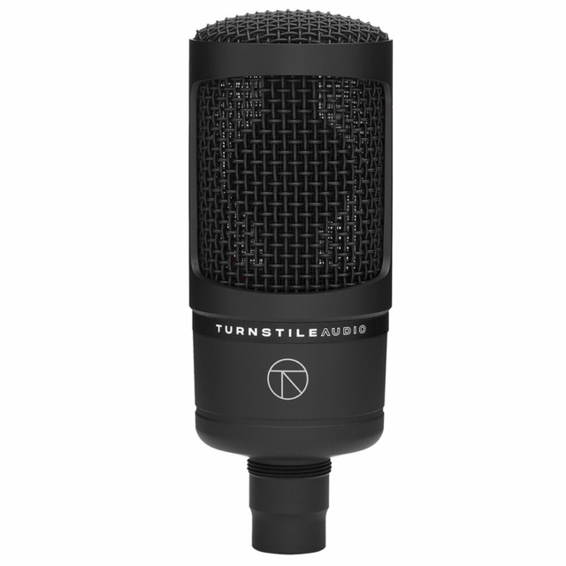
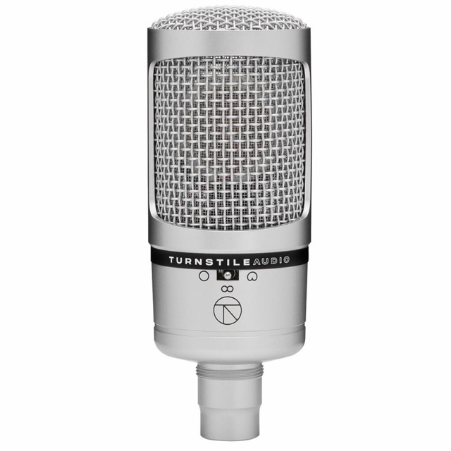
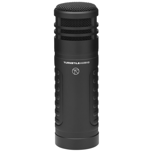
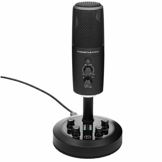
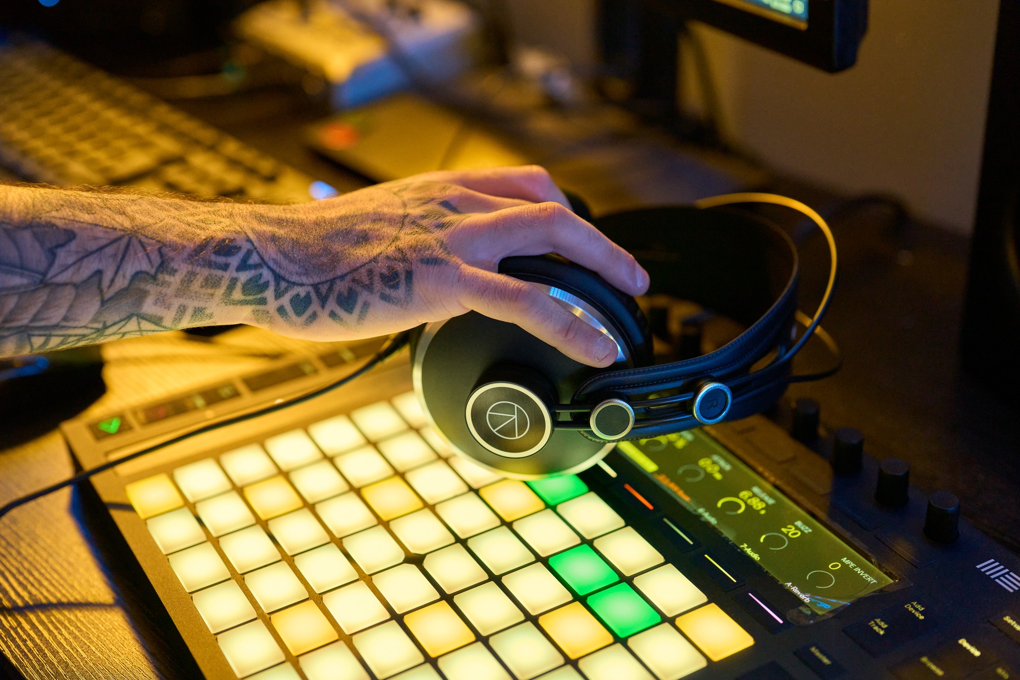
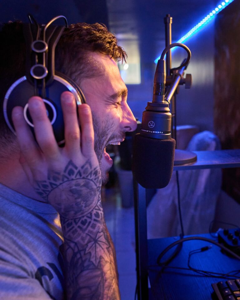 ✳ Take one · Turnstile Audio · In the studio
 "We had some very specific requirements for what we wanted the brand's logo to be. Well, DJ nailed it, it is timeless, clean, and best of all recognizable. I would highly recommend DJ for design work as he will present you with options from safe to pushing the boundaries which is exactly what you want to make informed decisions."
Mike Sutton · Turnstile Audio for Adorama
Let's build something
worth remembering.